Analyse a cohort
Analyse a cohort of service users
Overview
The cohort analyser allows you to compare groups of service users (cohorts).
Analysis by service provider or service type is undertaken in the provider analysis section.
Process - Cohort Analysis
Choose Service Users from the main left side menu
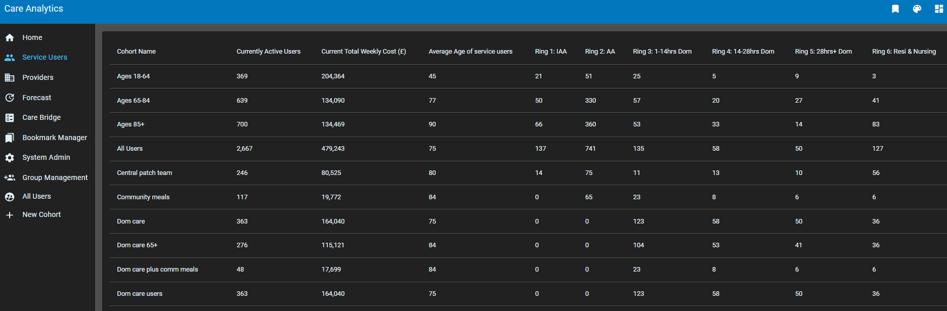
You are presented with a list of cohorts and summary metrics for each e.g.:
- The cohort name
- The number of service users in the cohort
- The current total weekly cost
- The average age of service users
- The number of service users in each Ring
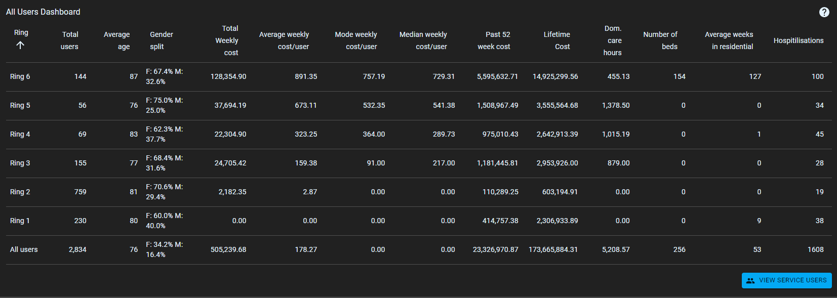
Clicking of a Cohort takes you to the cohort dashboard with a more detailed analysis
- A more detail table of analysis by Ring
- Under View Service Users:
- Clickable table of service users
- Map of service users
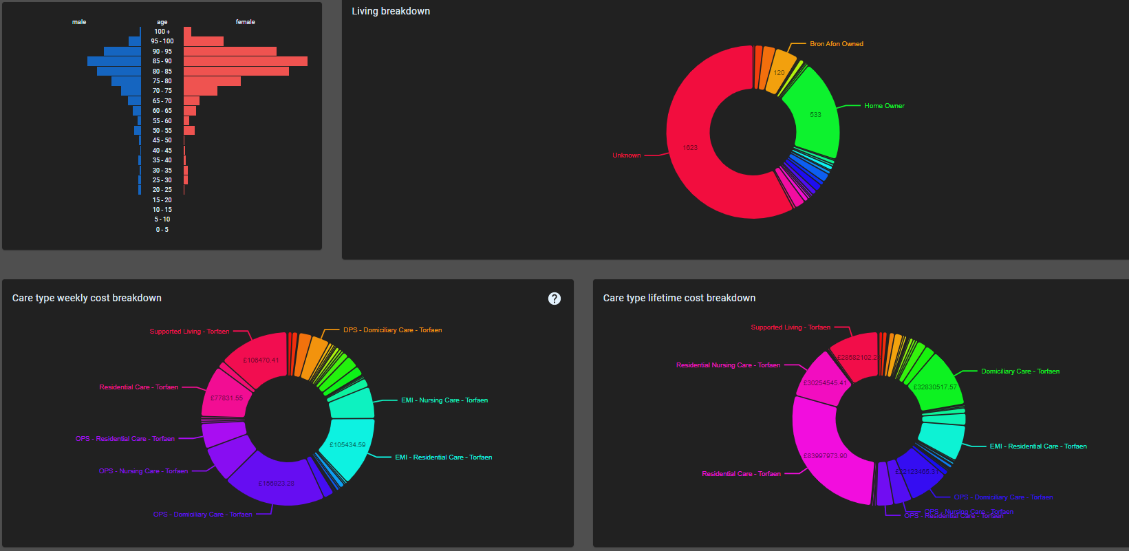
- Population pyramid
- Pie charts of
- Living situation
- Active services
- Care Type
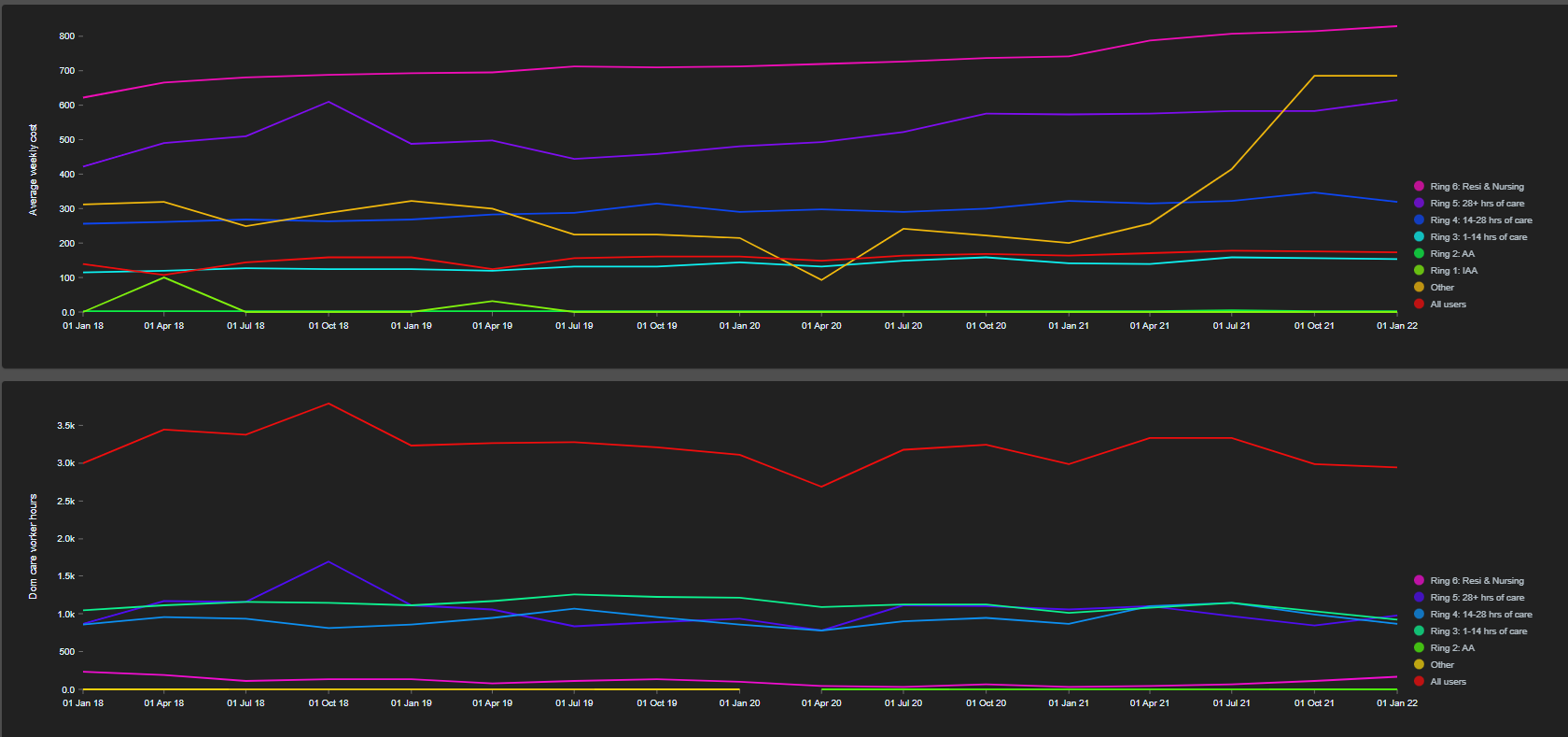
Historical Graphs of:
Number of service users in the Cohort
Average weekly cost of service users
Total weekly cost of the cohort
Total number of domiciliary hours
Total number of beds
These are presented by Ring and for all users